
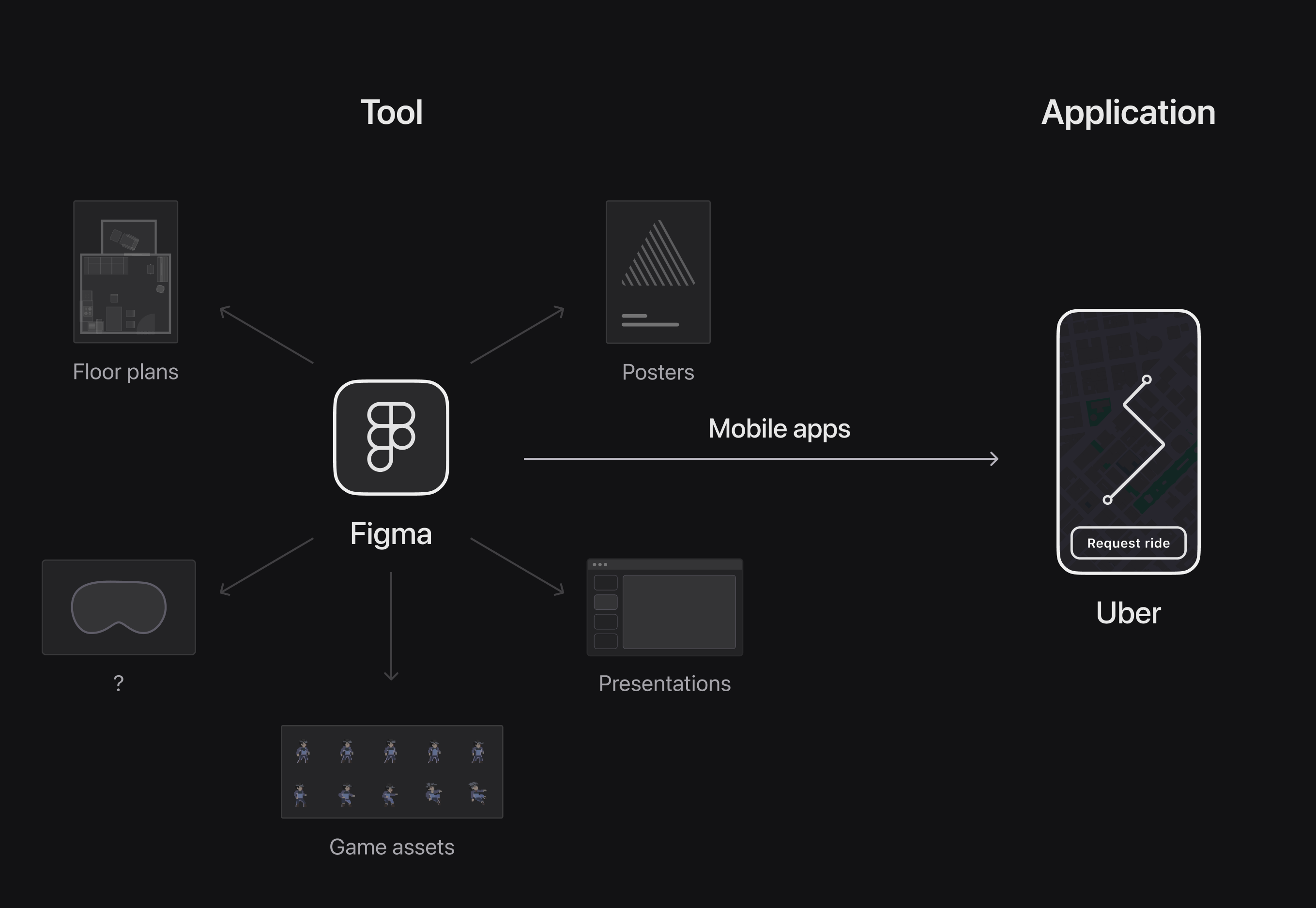
Software that accomplishes a specific task is an application. For instance, Uber for going from one place to another, or Google Calendar for scheduling a meeting at a given time are examples of commonplace applications. On the other hand, software that typically creates something tangible, including the applications mentioned above, is called a tool. Examples include Figma, VS Code, Procreate, etc. A defining characteristic of tools is the versatility and the unpredictability of their outcomes. A tool like Figma can be used to produce anything from a digital mobile app to the floor plan of a physical house. Meanwhile, an application helps accomplish a particular outcome most efficiently and conveniently for the user.
Over the last few years, I've primarily designed applications- software that helps users accomplish a specific task. Then, about a year ago, I started designing Playground, a graphic design tool that allows text-based image creation and editing. At the same time, I began analyzing other creative tools to understand the rationale behind their form and function. Sometimes, this led me to obvious, logical insights that explained why specific details were designed the way they were. Other times, I was left with guesses and speculations about the thought processes of the tool creators.
From designing Playground and studying other creative tools, I noticed design challenges that seemed somewhat unique to creative tool development. After encountering several such challenges, I started to discern their overarching themes. This article dives into these themes using examples from Playground and other popular creative tools.
Reinvention vs. Standard Practice
Designing a new solution tailored to a problem versus sticking with an existing but outdated standard, is a recurring choice when building early creative tools.
Mask Color
When the Playground team decided to add a masking feature to the tool, I instinctively opted for the mask color to be red. Red masks are standard in graphic editing tools, so it seemed like a safe choice.
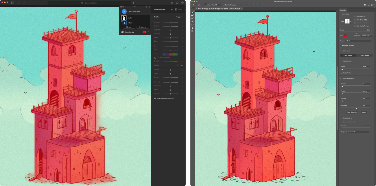

Later, out of curiosity, I dug into why these masks came to be red instead of any other color. I found that red masks were a metaphor for rubylith in print- a material used to block off light in various printing techniques.
With the diminishing relevance of traditional metaphors in a digital context, it's freeing to know that masks in editing tools don't necessarily have to be red. Understanding this opens up possibilities for more context-appropriate and brand-aligned choices. For instance, in the case of Playground, masks could be purple- more aligned with our brand colors.
Aspect ratio on resize
Many creative editing tools, like After Effects, Photoshop, and Illustrator, don't preserve an asset's aspect ratio on resize. Not locking the aspect ratio by default can often result in unintentional stretching unless the user deliberately holds down the shift key to lock the aspect ratio.
In contrast, note-taking applications like Notion and Google Docs, which otherwise don't support advanced image editing features, preserve an image's aspect ratio when resized.
Based on my experience, most tool users like to keep the same aspect ratio when resizing, more often than not. So, why not make it the default?
At Playground, we opted for this change – dragging the resize handles maintains the aspect ratio by default. Based on user reception, this decision seems correct. However, at the time, I was nervous about changing a frequently used action for which users had already developed muscle memory.
Vector editors like Figma and Sketch were an inspiration in breaking the norm and designing a resize behavior that was more relevant to Playground. In Figma, the image frame acts like a div block with the image inside set to cover. This works exceptionally well when the images are nested (a common scenario in UI design), and the user manipulates the parent element's size. The child image adapts perfectly to the resize without any disproportionate resizing.
Flexible vs. Opinionated
Another challenging aspect of designing creative tools is deciding when to guide users with a singular approach, which restricts certain action combinations, and when to allow for more flexibility.
At Playground, we've opted to provide more flexibility to our users. It's hard to predict how our users will use the tool, so it made sense to open up as many possibilities to our users as feasible. As Paul Graham writes in one of his essays, "...if you're trying to build a powerful tool, make it gratuitously unrestrictive. A powerful tool almost by definition will be used in ways you didn't expect, so err on the side of eliminating restrictions, even if you don't know what the benefit will be."
Inpaint tool and Object eraser
Playground's Inpaint tool lets users modify specific image areas by drawing a mask and providing text-based edit instructions.
Users can achieve the same result through a second workflow- erasing part of an image using the Erase tool, placing the Generation frame on the erased area, and describing the desired fill.
The Generation Frame is used to create images in the Playground canvas. Place it anywhere on the 2D canvas, and based on your prompt, it creates an image in that spot. This behavior establishes a mental model where the Generation Frame can be used to fill any area in the canvas with an image, whether it's an empty area or a smaller erased area in an existing image. This mental model lends itself well to the Erase-plus-fill approach, making the workflow intuitive and widely used.
In his talk on user interfaces, Rasmus Andersson emphasizes the importance of consistently sticking with an established mental model to create predictable user experiences. Supporting both- the Inpaint tool and the Erase-plus-Fill approach provides flexibility. But more importantly, it ensures a consistent behavior for the Generation Frame, preventing users from guessing or memorizing when it'll work for a fill and when it won't.
Playground's Object eraser lets users quickly erase unwanted objects from an image. With the auto object detection turned on, users can simply click on the object they want removed, and click the Erase button.
The Erase-plus-fill approach works in this use case as well. The user can erase a portion of the image and use the Generation Frame to fill in a background that blends in with the surrounding background.
Like the previous example, we once again decided to support both ways of removing unwanted objects from images.
Creative tools often support multiple ways of accomplishing similar results. For example in Photoshop, if I want to remove an object from the scene- I have at my disposal, the Context aware fill, the Patch tool, and the Clone stamp tool.
Even though all three approaches can produce similar results, each manipulates the image differently.
• Context-aware fill uses pixels around the selection to inform the fill.
• Patch tool fills the empty patch with a different user-selected area.
• Clone tool does the same but with finer control over the fill.
While any of these methods can be effective for removing objects from images, some situations may call for one technique over the others due to the specific nature of the image, object, or composition.
Similarly, in Playground, a user might want to use the Inpaint tool to outpaint an image. However, it wouldn't be the most effective way to outpaint. Using the Generation Frame would be.
In case of early creative tools, supporting multiple workflows to accomplish similar results can often lead to confusion amongst new users about the differences between the approaches and when to use each. This is probably one of the biggest tradeoffs of introducing optionality in a tool.
Board and Canvas
Playground currently supports two modes of image creation- Board and Canvas. Board is a simple, column-based interface, focussed primarily on image creation. It's what Playground started with.
Canvas is a more powerful, 2-dimensional space for advanced image editing and collaboration. It's the successor to the Board, with all of the Board functionality plus much more.
Canvas supports all the features of Board, so why does Board mode still exist? About half of our users preferred the Board mode because of its simple layout, especially when using the tool on mobile phones. The other half preferred using Canvas mode on their laptops for its advanced editing features.
The close-to-half-and-half split in user preference made it difficult to deprecate the Board right away. So we decided to preserve both modes, at least in the short term. But the choice came with tradeoffs- every new feature must now be designed and implemented for two modes, leading to more product complexity and, eventually, more maintenance work.
Looking into the future, I'm confident that the two modes, Board and Canvas, will merge into a single experience. This will effectively meet the needs of both mobile and desktop users without making the product overly complex.
Pro user needs vs. Original direction
Another challenge in designing tools is finding the right balance between delivering what users, especially power users, ask for and maintaining the product's original direction.
Proficient users can often suggest ideas and expect benefits more tailored to a savvy user base and only occasionally applicable to the majority of the target audience.
Interface density
Long-time users often suggest a more compact interface for Playground, preferring it without definitions of technical terms and with much smaller font sizes. The compact interface would allow them to view all controls at once without needing to scroll through side panels.
Given that Playground's interface was designed to be more beginner-friendly, it makes sense that experienced users ask for a less explanatory, more streamlined design. Once a user fully understands concepts such as Image to Image and Control traits, there's no real need to keep showing these definitions. Moreover, if proficient users will spend so much time with our tool, we should make it comfortable and efficient for them to use it.
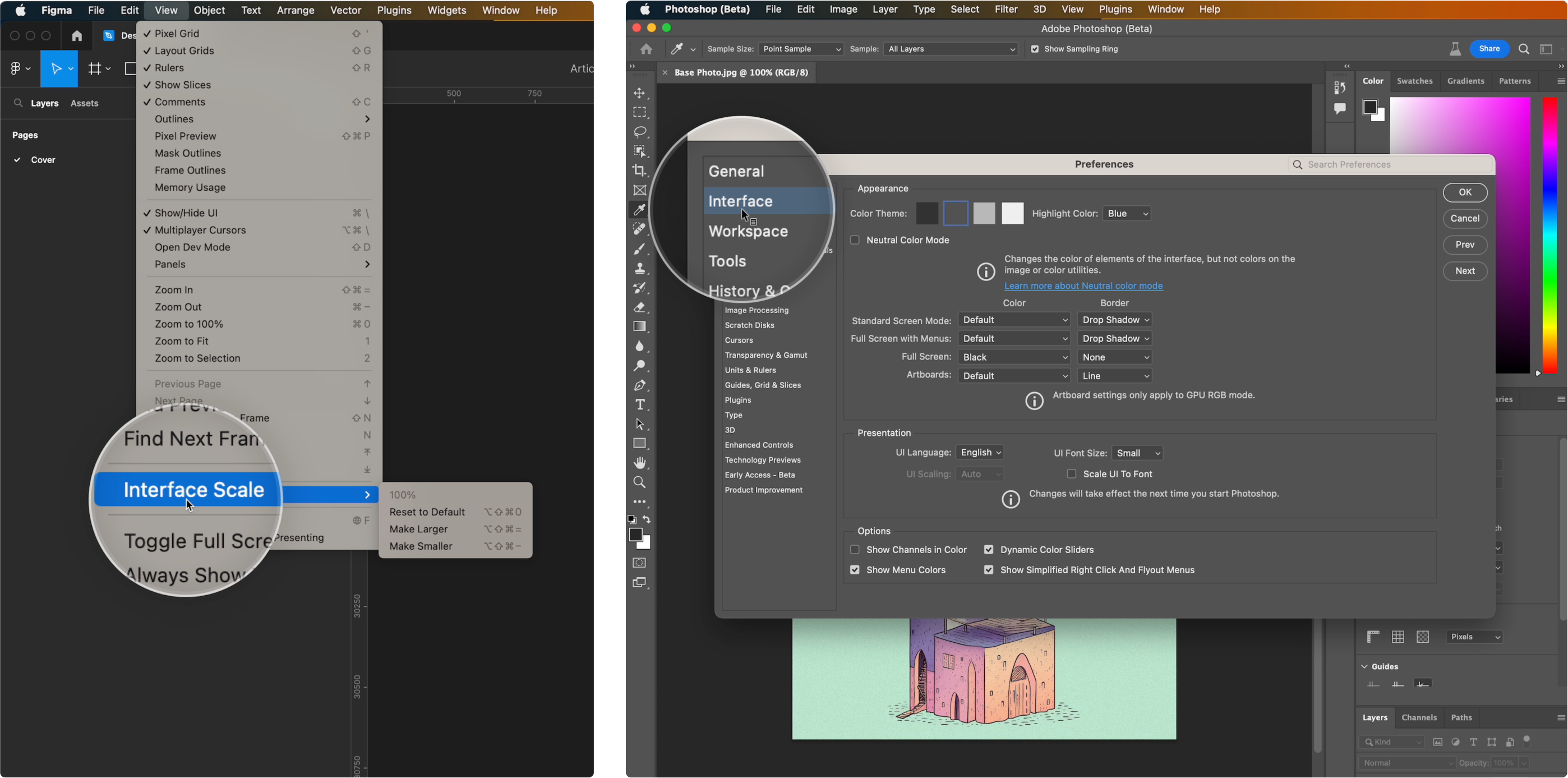
Above is a design exploration showing an easy way for users to make the Playground interface more compact. Similarly, Figma provides an Interface Scale setting, allowing users to set the tool's interface to a scale that suits them. Photoshop, on the other hand, provides a far more extensive set of interface configuration options.
Users familiar with Photoshop's extensive interface options frequently request more detailed control over Playground's interface, not just its scale. They wish to customize the editor by rearranging tools and panels, reordering settings, and adjusting other specific details of the tool's interface.
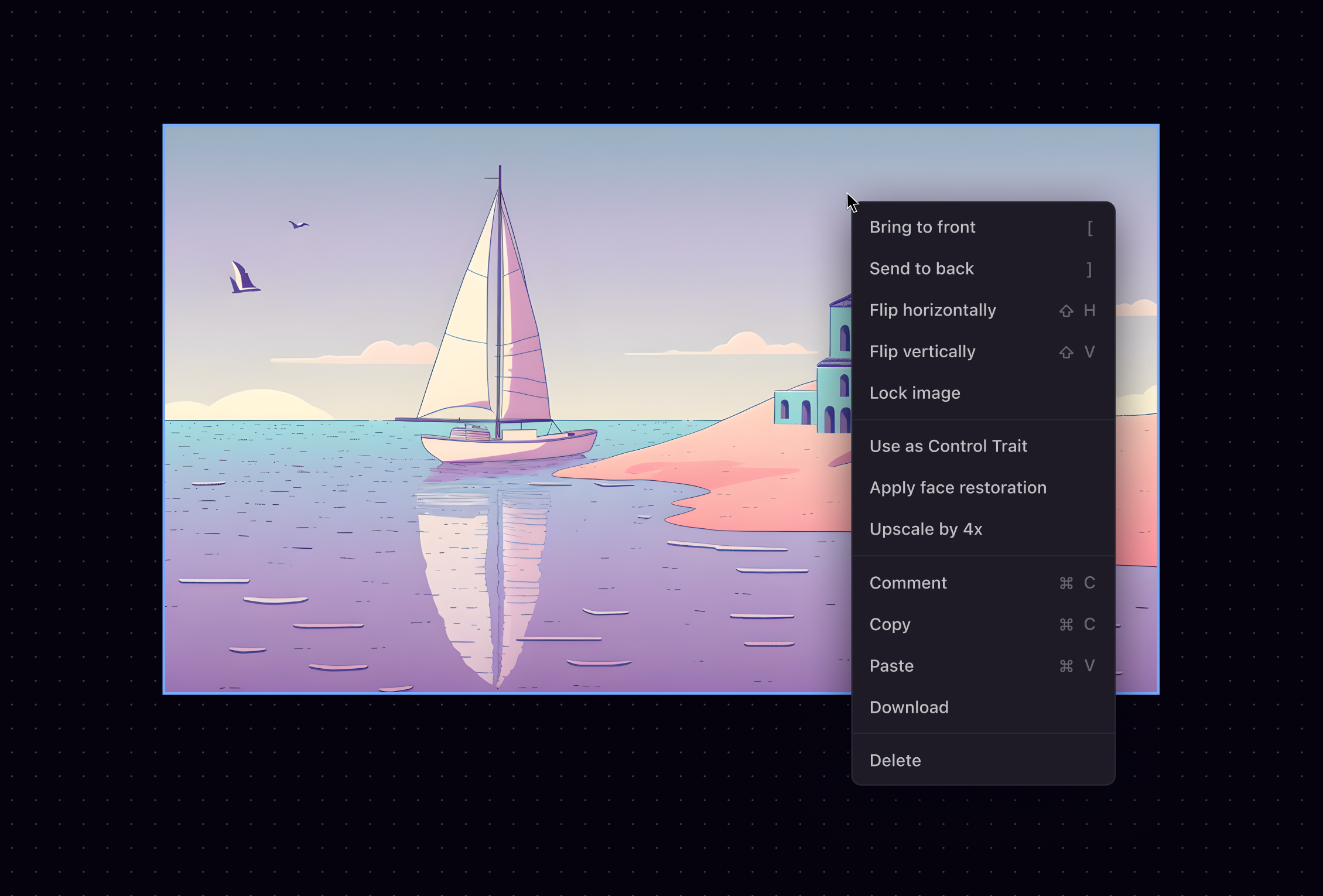
Below is an exploration showing how Playground's toolbar and generation pane could be moved around if we support interface customization.
There are many other examples of creative tools with highly customizable interfaces. Sketch, along with many other native Mac apps, allows users to completely reconfigure their main toolbars by selecting which tools go in the toolbar and in which spot.
Adobe's editing tools usually offer a plethora of interface customization options, including predefined layout options in After Effects suited for specific screen sizes.
VS Code is another example where users have plenty of ways to customize their editor. From how the code gets formatted to the content of each information panel, there's a way to customize every small and big detail.
Looking at the above examples, it's clear that the range of customization options differs significantly based on the tool and its usage. Some powerful tools like Figma offer only a few ways to customize the interface. In contrast, tools like VSCode and After Effects allow for extensive customization. Others, like Sketch, benefit from being native MacOS applications. This means features like toolbar customizations are handled by built-in MacOS libraries. As a result, developing and maintaining these features involves minimal costs.
Deciding how much interface customization a product allows seems to be a function of the product's maturity and philosophy. As an early-stage product at Playground, adding more interface customization options adds more product states to our editor. These states quickly become hard to maintain, scale, debug, and teach. We're open to providing settings that make our tool's interface more accessible and efficient. However, allowing users to reposition and reorder every panel and tool would deviate us from our primary goal of making a simple and powerful tool.
Quickly accessible controls
Another request we often receive from proficient users is the ability to access frequently used tools and actions more quickly. Keeping this in mind, we've built shortcuts for all the tools and frequently used actions in our editor. These shortcuts are presented to the user in various contextual moments.
However, not every user is good at memorizing keyboard shortcuts, so we explored a more UI-centric approach to give users quicker access to actions. Inspired by game menus and some of Rauno Freiberg's work, we explored radial menus that appear on mouse press and the action gets selected on mouse release.
Procreate, a popular iPad sketching app, follows a similar paradigm to let users quickly get to their most-used actions.
We also heard user requests for more sophisticated shortcuts to perform sequential bulk actions. For example, restoring faces, upscaling, and downloading the image via a single action. This prompted us to explore customizable shortcuts, enabling users to assign preferred shortcuts to a sequence of actions.
Figma recently introduced a hardware solution that allows similar shortcut customization, assigning them to specific keys on a dedicated shortcut keyboard.

A lot of the design ideas we explored above, including radial controls and customizable shortcuts, are great for experienced tool users. However, given that Playground's editor is still in its early stages, there's a significant opportunity cost in focusing on interaction efficiencies over building more advanced editing features. Building a simple and powerful tool remains our highest priority. But as more of our user base transitions from beginner to proficient, the future where we invest heavily in interaction efficiencies doesn't seem far.
Closing thoughts
As someone who constantly strives to find the 'correct' design solution for every problem, I find situations with no clear answer uncomfortable. With this article, I hope to shed light on the challenges of designing early creative tools and, more importantly, highlight how subjective the solutions to these challenges can be. I also wish this write-up encourages more designers to share and discuss their challenges, ideas, and solutions when building tools. And that it makes us all a little more comfortable acknowledging the subjectivity of our roles as designers.
Have thoughts, ideas or just want to chat about design tools? Reach me at aakankshamirdha@gmail.com.
Thanks to Suhail Doshi, Mrinal Mohit, Tayler Aitken, and Lois Yang for helping me put ideas into words.